For anyone who wants the Link - Twitch
3 Likes
Has the profile page been updated as well? I can’t remember seeing it
I’m watching the stream now.
I’ll comment more in detail later but so far I have a concern about the hero menu’s usability on console. It looks like the awful troop menu where you can’t go backwards alphabetically from A pushing left to go straight to Z (if there was a hero class beginning with Z). On consoles it’s a complete pitfa to navigate. A tile based system where everything is on a static screen is far more user friendly. Scrolling sideways like that is impractical and people will feel sick. Oh and your guy needs to look at the colour brown, because that ain’t brown guys! I’ll look forward to seeing the rest of the stream and will comment further. Thanks guys.
Nephilim
@Cyrup
1 Like
Great stream folks. Sirrian and cyrup are a fantastic combo. I love the new chest menus, openings and the ability to open up to 200 at a time. Great job.
Some of the new graphics are fantastic and I am sure you will get there with this ui eventually but please, please please, test it out on console too as currently building teams with it is horrendous.
Cheers
Nephilim
2 Likes
The guild seal packs are are 1,2+3 keys for the guild. The most expensive one currently gives 4 guild keys. Is this a display bug or an incoming nerf?
I want the search by trait back!!!
3 Likes
You may be the only one who ever used it. I just search for the name of the trait if I desperately need to find troops with that property.
Yeah but on console typing is more laborious then pc especially when you use a controler
There is a pic to show you how it is fun to type on xbox

4 Likes
Yeah, in-game, they don’t even have auto-text suggestions to reduce the pain.
Now that I think about it, I think it’s possible to use my phone keyboard to type, but it is kind of a pain to link my PS4 app. I don’t think I’ve tried it in GOW so I’m not sure how well it works. Might be a possibility though…
Scrolling through 100+ traits to try to get to Necromancy wasn’t exactly fun either.
Still was faster ![]()
I have found the keyboards for both PS4 and X1 are very helpful in typing, just my opinion of course, but I think they are well worth the investment long term. I am referring to the mini keyboards that fit on the controller.
1 Like
Yeah these keyboard work fine i was refering to the controller
The sideways scrolling was horrible on a mobile device or PC, but great on a console. Typing is just the opposite. It is apparently exceedingly difficult to design a single UI that works across all possible devices and input methods, but that is what the devs want to do. Good luck and Godspeed, Infinity Plus Two.
1 Like
I beg to differ. Sideways scrolling is lousy on everything, but at least we could jump to the end of the list by pressing left.
It seems like they are making little improvements with each pass now, but it is clear from the stream that the console interface is still very much at the back of their minds, at best.
1 Like
This is a display bug, Guild Elite will still be giving 4 keys.
1 Like
Sooo…apparently the new UI changes were shown? Anything us people not able to watch the stream for various reasons (mostly technical ones) can see screenshots? I thought @Cyrup wanted to make recaps of the streams somewhere (unless I misunderstood?) and I can’t seem to find them. Am I blind?
Here we go:
Kingdom menu:

Hero Skills menu:

Hero Masteries menu:

Hero Armor bonus menu:

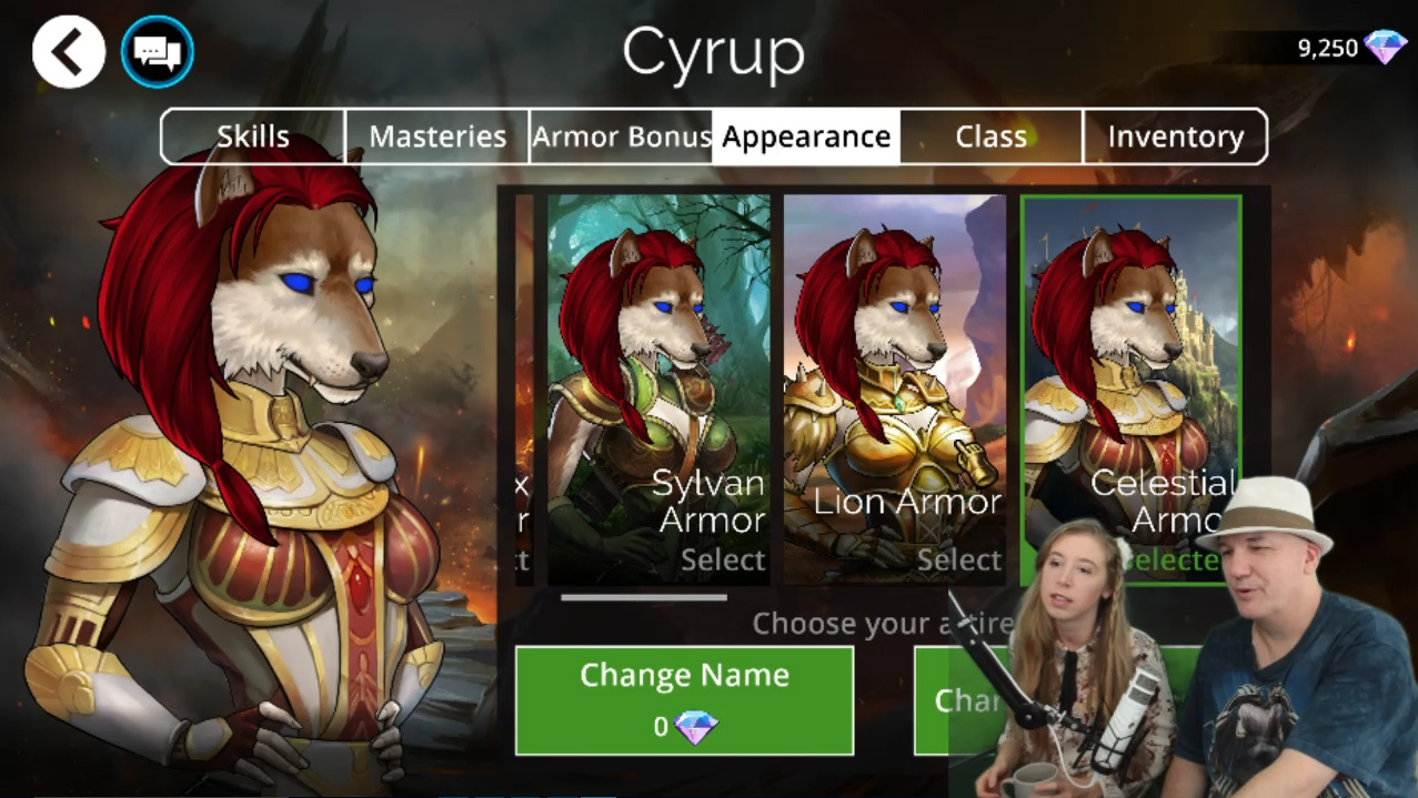
Hero Appearance menu (you can change your name, free the 1st time, with gems afterwards, bottom right button is the Change your Hero menu):
Hero Change your Hero menu:

Hero Class menu:

Hero Inventory menu:

Chest menu:

Glory chest menu (same for all other kind of chests, bottom right button is “Open 200 chests”):

There is a fancy animation where you can see one by one the troop. And you can skip to this menu:

When you level up a troop:

PVP menu (Ranked and Casual are almost the same):

PVP stats:

Guild overview:

Guild Tasks:

Guild Shop:

Guild Roster:

Guild Leaderboard:

Shop:

New monthly bundle:

Battle:

16 Likes
Thank you SO MUCH for this!![]() This is super-helpful and must have taken you quite the time to do!
This is super-helpful and must have taken you quite the time to do!
Okay, here my comments:
- Kingdom menu looks fine! Explore should still get the question mark showing what other stones besides the Arcane drops, though (helpful for new players).
- I’m glad the large hero art is still visible in the hero menu. I do miss it a lot on the worldmap.
- I’m not quite sure what to think of the Masteries menu. I feel like the graphics should match the gems (or will our gems look flat like this one day?! Yikes!)
- I really like the fact that the armor menu previews how the current hero will look in the armors. However, the pale numbers aren’t very well readable for people with vision disabilities in the armor bonus select menu.
- Sidescrolling in the class menu is… bothersome. I honestly prefer being able to see all my classes in a smaller space so that I need to scroll less. It is, however, nice to see what kingdom each class is from. Still, this is a hassle to navigate, just from the looks of it.
- Inventory menu looks fine, just damn, those traitstone images seem tiny and hard to make out. Is it just me or are they smaller than in the current version?
- The chest menu looks good - no green buttons, that’s very nice! - but I find the order a bit weird. Event and gem keys are what people have the least, gold what they have the most, so why is gold kind of small in the middle? I guess I’m just too used to the current system, maybe, though - muscle memory will kick in soon enough.
- The actual chest menu looks fine - just hope those buttons don’t flash yellow!
- Is the chest sidescrolling gone?! The menu seems to imply so. I would be SO HAPPY about this since nausea and me are pretty close buddies because of the chests by now.
- Liking the fact that its shown at which level the next skill increase is! Hope that’s also visible in the hero menu somewhere since I’m above L1000 and don’t get those often or masteries at all anymore.
- PVP menu looks okay, but those reward numbers and especially the guild name of the players are barely readable. I also wish the refresh button wouldn’t be at the bottom, I just know that I will accidentally click it because a lot of buttons (like the cast button) are in such places.
- REALLY really sad that the devs didn’t consider the guild panel mockup someone else did here on the forum for the tasks. It really looks messy and the percentage isn’t a helpful number. Probably the screen I dislike the most.
- New monthly bundle looks like something I might buy if the new UI changes won’t suck too much and the sidescrolling is gone.

- …Battle board is still semi-transparent. My eyes weep. Or is there a change from the current version I cannot make out right now?
Overall stuff: I am happy that the changes seem to get rid of the green button in most places and the new green buttons seem to be in a better color (and I hope they don’t flash). Overall, all the grey and black is still super-depressing and I wish the black would at least change to a dark blue, but useability seems to improve. REALLY hoping sidescrolling during chest openings will be gone and REALLY hoping that the board will return to being non-transparent.
Also it seems like the border colors of the troops have not changed, meaning the text on some of them will still be unreadable in the troop menu? That’s sad. Hope the borders will be improved in the future.
Overall conclusion: The UI is making a step in the right direction in quite a few places, though it’s still depressingly dark and the flat look of many things is jarring (and not matching the 3D backgrounds and item symbols well). Also hoping the health problems will fully become erased soon.
3 Likes
They said sidescrolling while opening chests will be gone. Back to vertical, thank god! They mentioned moving placement of gold and (i think) glory chests as well. Gold chests first, bottom left. And now there will be option to open 200 at a time. Kinda cool, especially now that we can scroll vertically again.
2 Likes
Thank goodness! This is such a huge improvement then and takes care of one of the main health issues! I look so much forward to vertical scrolling again! And glad to hear the gold chests will be moved to bottom left; seems more intuitive to me as well. Thanks for the info, this is appreciated!
1 Like