I am missing the section ‘Newly introduced bugs’ in these patch notes.
You may also post them in a new topic, if there is no space for them.
I checked my calendar just to make sure …
… And it shouldn’t be 1st of April today.
Jokes aside - is there any word from devs? Do we have to cope up with this, or is there anything at least discussed in terms of changing this visual fiasco?
It’s the end of the business day in Australia – well past, actually. There may not be anyone around at this point except Sirrian (who seems to spend an unhealthy amount of time working) and Salty (who can do some of her job from anywhere with an internet connection).
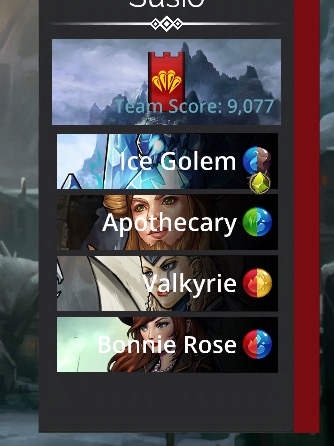
Unique defense troops will receive a bonus to the player’s Guild Wars Score
Please explain this. Unique how? Per day? Per team? Per week? Somehow different?
If you use no repeated troops on any of your six guild wars defense teams, you get maximum points from this source.
Its 500 points per troop. Max 2k a day, 12k a week.
Troop def will lock at the start of each day for that colour, and you will be unable to change it after that.
Yes, your VIP money went to their new artwork makeover instead of the bug fixes this game is in dire need of.
Thank goodness we did not spend that much. We always had to make a choice when it came to buying something from this game versus for the same amount buy several games/ add-ons from other gaming companies worth our while. It pays to be super-sensible at times!
I will give you a constructive feedback too:
Remove this fucking shit new Ui RIGHT NOW and put back the old one! And fire the dumbass responsible for this mess.
Believe me, you wont read a better constructive feedback than this one.
Thank you for your raw honesty! Seriously, thank you!
![]()
![]()
![]()
![]()
![]()
![]()
![]()
![]()
![]()
![]()
![]()
![]()
![]()
![]()
![]()
![]()
![]()
![]()
![]()
![]()
![]()
![]()
![]()
![]()
![]()
![]()
![]()
![]()
![]()
The people agree!
I don’t even want to log in and play. We are playing against you today right. ![]()
![]()
![]()
![]() This is so bad on my eyes.
This is so bad on my eyes.
I feel the same. Actually I just dont want to play this game anymore. I still cant believe what happened. Everytime I look at this horrible white and black menu in the world map, it hurt my eyes. In all sense of the term. Fortunately I can still open chest or hero menus to find back my beloved gems of war.
I wear glasses and if they ever break, it is considered a medical emergency. I can go blind without corrective lenses. My eyes water profusely playing this game.
@Nephilim I was. and I was referring to Sirrian’s initial revel thread from July, with over 350 posts! More posters of the ‘I like/love the UI’, or zero thoughts on it. One poster made personal attacks at me for my UI comment, but he’s a odd duck so I ignored it. If anything I was not harsh enough express my initial thoughts all those months ago when there was time to do something about it. I guess I can take something and extrapolate what its going to look like everywhere…
I’m glad now the opposite it the case and only a handful like it.
oh my god!!! it is a disaster ![]()
@Mithran
I was watching the Cubs fall apart last night but I’m right there with you on you gameplay comments. I’m also very concerned about a large number of troops being indirectly altered by the ‘minor’ bug fix. I’m think that might have to wait until day 2 or 3 until everyone has their say on the UI.
On Xbox eyes are tired after 15 minutes of play. The outcome of players has begun…
Please add a continue or quit button after explore, it’s really boring to get kick to the world map every time
I remember Salty saying that we would get something for the 3rd Anniversary of Gems of War. I didn’t realize that ‘something’ was a kick in the nuts.
Worst. Update. Ever.
Ok, not to harp on it, but the change of artstyle for the UI is -seriously- grating.
The gameworld itself is colorful, bright, with fantastic landscapes as backgrounds, kingdoms, and monsters, and the UI elements are colorless, black and white, flat and drab.
It seriously grates. The new style would have worked for a futuristic game, but right now it is looking like placeholders, because the real artwork isn’t done and ready yet. No offense, but, well, it looks extremely cheap:/ Sorry. Like someone made this on the weekend and tells his potential players “the real art sets will arrive next week”. or as if you guys did run out of money for assets.
Also, why are all the portraits suddenly zoomed in? We kind of would like to SEE the monsters we play.
Another nitpick is that, when we go to look up rewards, and what was opened in chests, I could just click out of it by randomly clicking on the screen. Now I NEED to click the button at the bottom. Slowing things down.
These are pretty much my two points.
Guys, you really need to consider if you want this to be a fantasy themed game, or if you want it to look like a mish mash of an Iphone ap having accidentally landed on top of it.

The look and feel is awful. I feel relaxed when I find myself back on a normal GoW screen which hasn’t been updated.
Who decided the enemy needed a red sash? Me on left, enemy on right wasn’t enough?
Who is this new troop ‘nnie Rose’ ? Honestly, how does this pass any basic quality checks.