Please do a simple sort of the banners into 3 groups that makes intuitive sense when we scroll through it:
+1/+1 banners all together
+2 banners
+2/+1/-1 banners
I could not care less the order in which they appear, I will just click through until I see the group I need and then stop and look for the specific color combination I want.
Within each group you will obviously further sort them by color, but that doesn’t help me find anything.
P.S. Showing the banners within each match would be nice, but that’s a lot more work and a totally different issue.
Yes, it would be useful - and I guess very simple for the devs. I think another feature would be nice too, although a bit more complicated, filtering. Let us display only banners that have a bonus to selected colour - any bonus and specifically +2 bonus as a different option.
A drop-down box or some other way to select banners where you can quickly see a bunch at a time and select from a list would also be nice. Right now, selecting a banner feels like you have a box of banners in no particular order and are are blindly grabbing through them, looking at them, and putting them on the bottom of the stack, repeating until you get the one you want. Eventually, you get somewhat of a feel of where they will be in the order, but even now I’ll always end up clicking past lesser used banners a few times before I find it, and if often takes way too many clicks and too much time to simply switch a banner on the fly before going into a PvP match. If it was simply a list, sorted by either color(s) boosted, banner name or name of kingdom of origin, you’d simply click to expand, quickly be able to see where the banner you want is, and click to select.
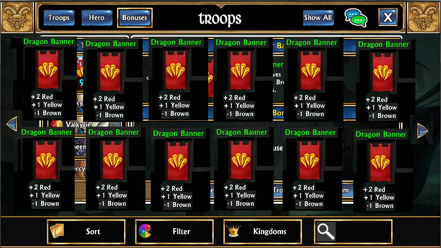
Why are the Banners sorted the way the are?
It may seem like banners are sorted by a random list, after all they don’t appear in order of kingdom release of when you unlocked them. However there is a reason behind the way they are sorting… by the kingdom they unlock from.
Kingdoms have a number id assorted with them, based on the order the kingdom was originally added to the game during development. The banners are attached to the kingdom (so they can be given when unlocking a kingdom) and so sort by that kingdom id.
What about changing it for the future?
We can definitely look at way we could improve it for the future, but we couldn’t make any promises, as we need to take navigating menus on smaller mobile devices into consideration.
maybe something like this?
(to switch between banner shapes, the 3 banners on the right side are there to show examples but they wouldnt be present there)
I agree with this, colours would make more sense and be more useful. Usually you’re picking banners to match a team and buff a specific colour, not looking for specific banners to build a team around. And if they do it that way, then the UI is already built and works on mobile, which seems to be @Nimhain 's concern. Just use the “mana filter” button at the bottom of the screen. Right now if you’re on the “Troops” tab it filters troops, and on “Hero” it filters the weapons. So just change it so that on the “Bonuses” tab it filters the banners.
Except on console when we get the “win X battles with the banner from ______” daily task. Being able to identify which banner is from which Kingdom is another thing they could improve, but that has been discussed elsewhere.
I just play on PC/mobile, so wasn’t aware of that. I’d suggest that the general solution of just re-using the filters that are already there, in this case “Kingdoms”, would solve this as well.
Note that I’m not saying this is the ideal design, just that it should be far simpler to do, and “perfect is the enemy of good”. I’d much rather have something soon that can do colours and kingdoms, then something that does everything in the most awesome way, but isn’t available for six months to never…
Still think that the easiest way would be to have as many of them visible as possible. Eg., a change banner button where the original banner select is that, once pressed, will activate an overlay up showing as many available banners as will fit on the screen. Instead of spelling out the banner’s effects on the screen, simply state their effect on mana underneath. Poor MS Paint skills aside, something like this:
As an overlay, you could easily fit 12 of those on the screen at a time with a bit of extra vertical room if you wanted to add some sort of indicator to which kingdom they were connected to.
(pretend all these are different banners and the background is faded out)
Click change banner, click the banner you want, done. This reduces both the number of steps to change a banner and makes it faster to select the one you want.
I went for something that could literally take 5 minutes using currently available code and resources and would (theoretically) not even need to be tested before implementation.
I’d LOVE a color filter way more … but that involves work.
Great topic, great replies! Gonna use some Likes here I say.
What about a 4th button added to the top of the Team Building UI that reads “Banners”. Then in the “main window” of the Team Building UI just show the entire map w/ Banners zoomed out, then let us click/tap the Banner we want to use.
Or maybe keep it under the Bonuses button but put the Team bonuses in a thin vertical list and use the map idea for the center of the UI.
@Nimhain you were saying there are space considerations with keeping the UI portable across a wide variety of platforms, would this be too much clutter?