Sorry for the delay getting back to you, I’ve been sick. As for fitting more information on screen without zooming, would shrinking the task descriptions help? I was also kicking around an idea for making the column categories into three state toggles instead of two state, with the new state being to hide them entirely - so, you could hide the class or faction information entirely if you didn’t want to see it, for example. Those sound like promising approaches?
7 Likes
Oh, I’m sorry, I hope you’re feeling better now!
As for the rest, you’ve mentioned exactly the two things I was thinking about! Reducing the size of some elements, where possible, like the task descriptions you mentioned, enough to avoid scrolling left and right, would be a great idea.
The second option, the ability to hide some elements, could also be useful. Not only for the sake of having everything in front of you, without scrolling, but also because someone might prefer to have only the information they deem essential, hiding the rest.
For my part, I find pretty much all of the information useful, so I think option 1, reducing the size of some elements until everything fits on the screen without scrolling, is the best choice. So yes, it’s absolutely the best approach, and both are excellent ideas!
Thanks again for your work!
3 Likes
Still sick, but I think I’m on the mend. I went and applied the fixes, check out the site and tell me what you think?
2 Likes
I hope you feel better soon!
I checked out the website, and for me, it’s perfect. It seems like a small thing, but it’s not; everything is more intuitive and easily visible. I hope everyone else appreciates it too. Thanks for these changes!
No problem, glad you like them! I’m also looking at the change someone requested for making completed but uncollected tasks more obvious. Does this look good?
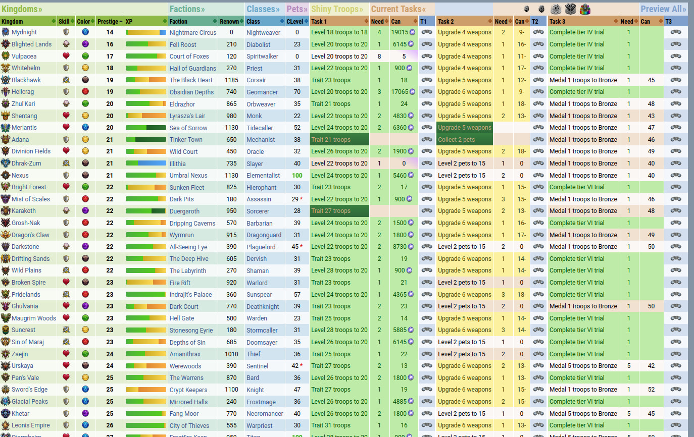
Also need to remember to go update the achievements… And, while I’m at it, I might as well take the opportunity to wave my tip jar around: https://ko-fi.com/angularangel
6 Likes
Absolutely. I hadn’t thought of that, it looks much better. It’s definitely another great improvement.
1 Like
Alright, pushed. Now for all the other stuff… XD
“Reach prestige level 50 on all kingdoms” .
Please add :
“Reach prestige level 40 on all kingdoms” .
“Reach prestige level 60 on all kingdoms” .
“Reach prestige level 70 on all kingdoms” .
Thanks for taking over this site and updating it! 
One minor thing I noticed: on the Achievements tab, the pop-up for troops not yet at mythic with four copies defaults to “3” for anything missing 3 or fewer copies.
For example, I have 2 copies of Abynissia and 3 copies of Aguara, so those should display “2” and “1” respectively.

Regarding prestige levels for 40, 60, and 70, I don’t see those on the steam achievements… Actually, I don’t see achievements for prestige levels on steam. Is this a custom request, or…? I’m not sure if I should deviate from the steam achievements… But those seem to be missing for prestige levels anyway, so… 
Oh, and I fixed the bug for the ‘collect and ascend all troops’ achievement, while I’m at it.
Edit: Oh, right, I also added Maelstrom Dago and the floral dragons and their weapons to the achievements. Still need to find the right values for the evil dragons, but that can wait.
2 Likes
40,50,60,70 - give +1 !! And this is important for players
The majority (if not all) of Gemologica achievements are unrelated to Steam achievements, unless I’m misunderstanding what you’re saying
1 Like
Okay, sorry for the radio silence, still been sick, and busy with other stuff. I went ahead and updated the prestige level achievements - made them be for every ten levels up to 70.
5 Likes
Okay, pushed a bunch of stuff, including some basic soulforge support and local caching, plus a refresh button that doesn’t require reloading the entire page.
8 Likes
So, can I get some feedback on how you all use Gemologica? What features you rely on the most, your general workflow with it, anything that’s awkward or that it almost does, etc, etc?
Also, cleaned up the soulforge tab a little, and the links all go to KrystaraDB now, and should like, actually work.
1 Like
Personally, I use it for planning kingdom development, so looking at what tasks I need to do, and now which kingdoms I can upgrade using crystals. The progress bars are great and having the totals at the top now is really useful.
The only thing that’s a little awkward is seeing the tasks for a specific kingdom, like having to scroll across and remember which column is which, but it’s good how it is and with so much information I don’t think there’s an easy way to show it any better.
Thanks for your hard work. It’s such a great tool for playing the game.
4 Likes
Did you notice that you can entirely close the faction and class sections by clicking their headers a couple times now? Does that make things easier?
Also, there’s an option to expand the task descriptions, which puts the kingdom, class, or faction name in just about every task.
Using these two features, I usually have my own page set up like this:

3 Likes
At the moment: using it mostly for prestige leveling:
- I get a crystal: what should I spend it on? Which magic kingdom would this rainbow be best spent on? which colored kingdom would this colored crystal be best spent on – are any of them magic? or less than 50? or close to leveling up already? etc etc
- I’ve collected some medals: which kingdoms still have elite tasks outstanding? which can I finish most easily? I fear that soon all this falls away as I will be blocked by shiny tasks but for now, yeah.
But also sometimes for class selection: which classes have useful magic/bonus mana for this color? which have a 50% start / barrier / cleanse etc? I can never remember so this is very useful.
In the past, in earlier game phases, I’ve used it for:
- Class leveling: which classes aren’t at 100 yet, i.e. I should be using them?
- Traitstones: what type/color of traitstones do I need for traiting my currently-owned troops? and then, for unowned / all troops? and where should I be exploring to find them?
- Factions: which factions are not yet at 500 / at 500 pure-faction, i.e. I should be working on those ones?
Workflow usually: a lot of expanding/closing sections on the main page, a lot of sorting of columns – it’s often useful to sort on one column and then another, because the sorts are stable. I really like that the view is compact and that things can be collapsed down – it gets a lot of targeted information on-screen at once.
Awkward/annoyances:
The headings remain when the section is fully collapsed; this often feels visually confusing – why are tasks under the factions/clases/pets/shiny troops headings?

I very rarely use the inline task previews (the T1, T2, T3 columns) so those are usually wasted space for me.
Have never used the “Preview All” columns other than curious or accidental clicks.
Have never really understood what the traitstone filters do:

(And now, clicking on the traitstone filters messes up the Tasks column ordering in weird ways that are fixed by reloading the page.)
2 Likes
The traitstone buttons tell Gemologica to pretend you have infinite of that traitstone, IIUC. Not entirely sure what that feature is for, but I guess it can be handy? Interesting to hear you make so much use of the class section, That’s a new discovery for me. And the section headers remain so you can re-open them… I could make them smaller though - three letters each when closed, maybe? And maybe see if I can sort it so they’re not tied to the table in weird ways…
1 Like
I forgot this was here, because I had the class tab closed, and spend ages earlier today looking for this info. Needed a 50% mana start class for the event. 
That’s really useful.
Just tested it out and yeah, that’s much better than just having the small/full options. Thanks.
1 Like