actually it does. Now in steam too. I can’t read a bottom disclaimer in a fullscreen 24’’ monitor

5 Likes
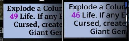
On a big screen it looks good. But hard to read on small screens. And while pets and troops have been converted to big letters completely, weapons have not?!
1 Like
Currently, Weapons match how Troop Spells appear - so they have that matching font
But I have mentioned that that is not obvious when you are just viewing your collection as a whole, so the new font on the weapon doesn’t match everywhere else the other new font is shown in the Collection screens
1 Like
Are there any possibilities to us to get an option in settings to turn fonts back?
9 Likes
As sad as it sounds, I’d pay $5 to get away from this current version.

3 Likes
I can make a QOL for Font options, for sure, but as a heads up, that is not something that likely would get implemented for some time.
3 Likes
that is very very sad) so, feedback can change it somehow, how it was in a previous UI changes with rainbow backgrounds and small numbers)
I have a little astigmatism and reading a chat and spell descriptions with that font (the one that is not uppercase) make me some pain.
6 Likes
and please, make one)
3 Likes
also, knowing specifically which devices and the screen size will be helpful.
24” monitor (PC) - if windowed like 1024 by widht - mostly unreadable in team roster. Same (worse actually) for 6.67” smartphone (poco x5 pro)
With a fullscreen fullHD (1920*1080) it’s readable, but eyes are tired) As to me it’s about spiked angles and smaller spaces between letters
7 Likes
I know it’s not your fault, but Nintendo needs to get their act together. But I’m actually glad that I don’t have to look at the new fonts for another week…![]()
3 Likes
Could a simple font rollback be envisaged before a larger ‘Font Option’ QoL?
It’s not the first time that a design implementation makes it very hard to read/see the content for some of our players, so hopefully we can try to avoid such (allegedly unnecessary “not broken don’t fix it”) non-optional changes in the future.
![]()
![]()
![]()
13 Likes
That is also something that already exists in my list
4 Likes
The new achievements for 8.8 don’t seem to be appearing on the Xbox.
2 Likes
There are so many things to fix in this game, which are not fixed and each time you make changes that the players did not ask for, all the time you spent setting up this horrible font could have been spent on something else. It is completely illegible, you have to make a mental effort to read each text. What is going on in your company to get to do things like this??? It is really a big mess, think next time before doing such stupid things.
8 Likes
Oh dear, I hadn’t seen that you also changed the chat font, seriously, did anyone at your place look at the effect on the chat before implementing this?? On a big TV, it’s a big effort to decipher the sentences. How is it possible to do things like that!!! I just tested it on my tablet with a mini-screen, for remote play and strangely, the difficulty of reading is less felt on the different screens of the game and chat. The worst is on the big screen.
6 Likes
EWWWW!
The new font is awful. I’m really struggling to read some stuff. My eyes feel tired after playing for a short time, and I actively want to stop playing, even though I’m still trying to do stuff.
I have an astigmatism in my eyes, too, so maybe it has something to do with it. Dunno, but it seems crazy that every time you do UI changes you make such terrible choices.
-
Before making any changes, please post pictures of a preview and get feedback from players.
-
Before changing UI elements, ask yourself “is this necessary or are we wasting time that could be better spent elsewhere, given that the game is full of bugs and has a list of dozens of QoL requests?" and consider delaying any UI changes until much later.
-
If you do make changes, PLEASE, PLEASE will you make them optional. Or give us options to toggle between. Give us choices and we’ll be happy. Force stuff on us and we’ll be mad. It’s that simple.
-
Have a system in place that if there’s a massive backlash to any UI changes, you can roll them back quickly and easily. Don’t be afraid to admit you made a bad choice and your previous ones were good, and go back to the previous choices.
I really cannot over-emphasise that you keep making changes that actively make the game worse and the community keeps pointing this out, and you keep refusing to listen. WHY?
![]()
19 Likes
Imagine a 10 yrs old game with tons of old bugs and they have nothing better to do than changing the UI with an ugly unreadable font destroying games identity even more. NOBODY ASKED FOR THIS! Vote with your playtime and your wallets!
10 Likes
Oh come on with the font!
We already have player base suffering from presbyopia. (Heck! Does anyone under 30 play this game? Even Tacet is getting there) Please don’t make reading chat etc even harder.
8 Likes
Oh my.
Please give us back the old non-serif font. This is completely out of whack on a mobile phone screen. (Samsung Galaxy 23+ and 10+). Legibility went out the window and refused to look back ![]()
Headings and troop names are roughly okay-ish. But the spell description text is just horriblest.
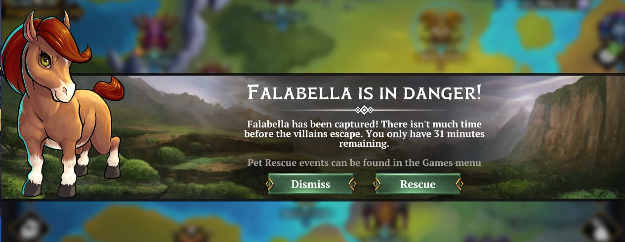
Example - FALABELLA IS IN DANGER - fine, I can live with that. Everything else - VERY hard to read ![]()
8 Likes