I’m just gonna divide my post into three main areas…
The Bad
What were you thinking??
As a UX/UI person who you have literally paid to help with the game before, I am telling you that you have either shot yourselves in the foot, or the face, with this set of changes. It looks… really bad… and its harder to use, like everyone is saying. With a few exceptions.
All of the below, and more, are things that simply should not be how they are. And my first instinct says to revert them.
- Losing the colorful aesthetics on main buttons (now blue/black/white).
- Inconsistent application of new changes - still have places like the hero, shop, pvp, settings, and other areas that have the old look inside.
- Kingdoms’ bonuses are much harder to see on the map.
- Home kingdom is nearly impossible to notice.
- Games/kingdom/guild/etc buttons now filling the screen with the ‘pick next thing’ options. See below.
- Gold/souls/glory/gems are no longer in a straight line in the main map UI. (REALLY?) See below.
- New Glory icon doesn’t fit… any… existing art style. And is applied inconsistently (hero resource collection has old icon still, etc).
- New main loading animation isn’t anywhere near as nice as … anything else we’ve had. (And the PVP one is okay-ish but not as good, and too busy to really see much…) See below.
- Impossible to read the light blue ‘team score’ numbers on a handful of kingdom backgrounds, Glacial Peaks in particular.
- New troop card appearance is hard to read in general, but especially in PVP.**
- In the Guild Wars area, “Last week’s results” being shifted to the ‘Register’ button doesn’t make sense.
- Button to resize the chat window isn’t particularly intuitive. (Needs to be hunted down and found…)
- Faded black margins near the top and bottom edges of the screen don’t do anything good. See below.
Areas we can click to exit these overlarge displays are marked in red. We used to be able to click almost anywhere if we miss-hit a kingdom by accident.


Seriously, this thing? Losing the old ‘loading’ animation makes me sad.

I’m sure I’ll find more things when I actually play more than 10 minutes with this.
The Good
The update isn’t a total loss. Things I immediately like:
- Wisp and Kraken can go straight to hell.
- Most of the new or reverted features in the troop area - new filter options, no more console-issue arrow buttons, etc.**
- New traitstone art, though it will take some getting used to.
- Streamlining the PVP end-of-battle rewards slightly by including the traitstone type in the main display and not requiring another display for it. Finally!**
- Red/Blue/Green/Purple for Attack/Armor/Life/Magic.**
- Streamlined tribute collection speed.
- The new look is actually good in the Guild War section - I like the Attack and Results tabs in particular.
- Upgrading sentinels can be done all at once (per stat).
To Improve
Some of these are marked above with **:
Still no real-time timestamps for chat. Come on guys! Pick a “Gems of War time”, stick a clock or something in there, and let us have this! This should be in the “bad” area…
Still no fix to the Kraken killing two enemies with damage and devouring a third. (And associated other troops with this issue.)
While the traitstone PVP reward was streamlined away, the ladderboard points and trophies reward was not. And should be.
Troop collection needs a scroll bar or something. (Also for the Weapons tab.)
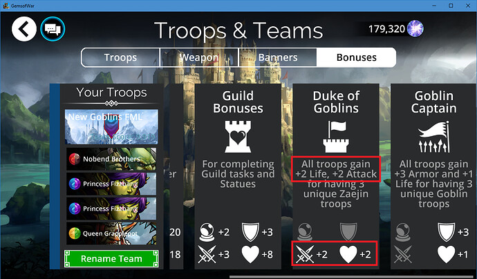
The banner and team bonuses… while the UI looks nice, those things all take up too much space and necessitate far more scrolling than they should. I’m playing on 1280x720 resolution, I pity anyone dealing with this on a phone screen.
I should be able to see more than 3.5 of these at once. Shrink the damn things please. Use two rows at once if you have to.
I see a huge redundancy here. Just say “For having 3 unique Zaejin troops” and save the space. Convert this section into a 2x2 grid, scrollable to 2x3 if someone runs a Human/Knight/Whitehelm/Swords-Edge team and has every possible bonus.
And then… Why is the Red/Blue/Green/Purple color scheme for troop stats not used… everywhere!?
This, with more than 30 seconds effort applied, would go a long way to making these easier to read. Could be used in the previous picture, team bonuses, also. And so on.
(Why does that little 2x2, from Guild Wars, have Attack above Magic, when every other place has Magic above Attack?)
I will have to wait and see, about losing the AI sliders. But that strikes me as another largely-invisible change, which I think will result in us going through another [possibly brief] period of not knowing enough about what the AI is going to do.
Lots of other stuff I’m sure I’ll find later.
This post took me about two hours to make.


