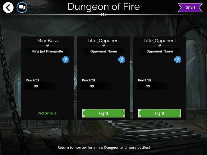
Is anyone having issues with the dungeon battles and crafting? With this new update I cannot fight dungeon battles as the face image is not loading for all 3 battles I only see name of opponent for example King Jarl Firemantle for today’s dungeon but no picture of the King only just fonts. When crafting none of the images are loading for the traitstones but I can still craft them but can’t see which crafting items will be used in the small circles. Also when I check my inventory of gems that i have no images are loading. Go back to the old UI I am extremely disappointed with this update as I’m loosing out on the dungeon battles for each day. Using Note 3 up to date OS lots of memory available.
Dungeon issue is happening to one of my guildmates too
Edit: now it’s happening to me too ![]()
Is kingdom tributes broken as well?! I’ve gotten the least amounts i’ve ever gotten since the update.
I believe tribute display is broken however, you do get correct amount of resources.
Next time check how much gold you have before and compare.
Edit: Simple answer, yes it is.
Thanks for letting me know. I have submitted a support ticket hoping this will be fixed as soon as possible
I managed to get it working if I force close the app and then go straight to the dungeon. Still hangs on rewards though
Playing on iOS, the graphics for the new update are terrible. Very hard to read any of the numbers. Can we get the old tiles back?
Yep, seeing this too. Android 8.0.0, Nexus 5X. Even after the asset download, no images, some missing text in Dungeon mode. Fight buttons don’t work at all.
Same Issues here…images not loading, hard to read text, buttons not always working. iOS11.0.3, iPad Air 2
new update good and fine, will be fix great. but when entering into battle mode, attack, defense, life and magic shown into highlighted white color found bad. sometimes eyes hurt when looking into it… old was great. really it would be good if it was change into older look or just change the look of it.
Filter functionality for over 2 years allowed a player to go back on all the filters so we could start with Zhul’Kari instead of Adana with a single move. This has been accidently and completely removed from every single filter! Add it back… or in the case include ‘up’ to take you to the bottom when at the first entry.
Edit: same broken functionality with Banners now it does not work going back from the start or right from the end.
Any dungeon issues or icons invisible, i fixed with an uninstall and reinstall. Don’t forget to write down your passwords though.
iOS: You accidentally left a prototype UI in instead of using the finished UI.
Used to, the troops had really good art that made them look like cards, and there were little flourishes like gold stars to help you judge rarity.
In this release, you accidentally released a UI that still has “programmer art” placeholders: card borders are just colored stripes, unstyled default system fonts are used for numbers, etc. I like where this prototype is going, but I can tell it still needs the artists to provide real assets.
Beside a list of all that will be left as it is until “next update” (when?), can we have a list of bugs that will be hotfixed (and when?)?
Try to uninstall, then install again. Worked for me. Android 6 on Samsung 6 edge. Remember to write down password before uinstall. Regards
Please look at this screenshot.
On the right you have some “old style” interface. The texts can be read without problems and its very usable.
On the left there is the team with the new style. The team name can not even be read over the background image, the team rating can be hardly seen, not to talk about reading it. The names of the troops blend with the background too and are difficult to read.
Also, the borderless style of the new style makes the interface difficult to use. On the right you can see the limit of every item withut any doubt. On the left look for example to the right end of the last troop, it is of the same color than the background and makes the interface strange and unpleasant.
Borderless is bad, seriously. And please, add contrast to the text, much more contrast. MUCH MORE.
PLEASE.
Finished my dungeon battles on PC, then visited the dungeon on my iPad. Look at these glorious placeholders! The art is stunning too!
X1
I was trying to do the Daily Tasks and change the Banner for a team and I couldn’t. Closed and re-opened the troop menu seem to work. There is a minor bug the Banner selection screen on console.
Visibility at least on a tablet is horrific. White or yellow characters on a light background? Maybe you can read it when you are 20 but I can’t


