Actually, you can prove it. Or could. Taran had a tool that you could check on people by invite code. As recruiter and guild family admin, I would do it all the time. Helps us learn about what to do to make our guild more enjoyable.
People do leave. We’ve lost several OG members over the GW changes and the color changes. I belong to one of the oldest PC guilds in the game. We have had more people actually leave the game than change (or not change) their name and just join a new guild. Usually, if they want a different guild, that’s what they tell us. Or they don’t say anything at all and just leave.
The big question to me was why the new font weren’t tested on the smaller devices. Even if I play the game mostly on big screens and it doesn’t influence me, a heck of load of players plays it on mobile and smaller screens. And yeah font also needs to get looked at because of the simple fact you want new players to stay too. Players downloading the game as I am talking to try the game for the first time. It is a patch/fix that should not be waited for.
Also as I have no problem with the new font as it is, please never remove it, do the necessary fixes for smaller screens tho, and potential try to make it optional in the settings so players can choose what they like to use, old one or new one etc.
I guess the play testing was done by Helen Keller. When this font is large, it’s OK - BUT - there are places where it doesn’t fit so you get weird run ons & when the font is small, you can’t read it!
I’m of similar opinion, came to forums to see if anyone had a screenshot of the “original” font, I’m sure it will take some getting used to. But it’s just disheartening to find out this is what the devs are spending time on.
Exactly that. If we were getting some of the qol we’ve been asking for i wouldn’t have minded a font but really? This is what the devs spend time and resources on? Its a shambles
I think we might be overestimating how much time and resources are spent on switching a font I’m no game designer, so this is speculative, but I can’t imagine there’s all that much that goes into it unless they custom-built the font. Also worth noting that this graphical overhaul has been a slow and steady process over the past few years. Plus, we’ve gotten official confirmation that Bastions have been pushed back to 2026 specifically to let the team focus on QoL updates, so it’s not like the team is saying “well, we had time to do some QoL updates, but we decided to change the font instead.”
I play on both a TV and my cell phone and have not noticed visibility issues. Those who are struggling with it - can you provide screenshots? That would help the developers see specifically where the issues are so they can be addressed.
Presumptively, it’s literally just a line or two in a config file somewhere with a reference to the font elsewhere in the game’s asset structure. So yes, it’s probably just as easy as swapping out a Troop’s card art (Priestess, Kitsune).
Oh I can definitely provide screenshots, I just need to offload them from my Switch first, but here’s a few observations generally (now that the update has hit Switch):
The experience differs by the player’s screen resolution – especially at 720p, the game’s lowest “desktop” resolution (e.g. Switch handheld). (I can’t speak for the resolution of the mobile/phone versions, anyone with those versions please add some screenshots too)
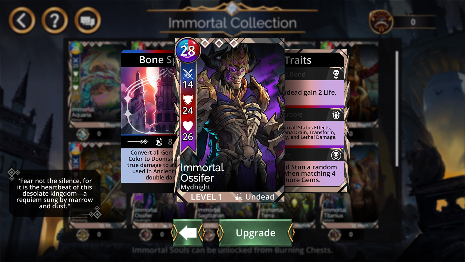
We call it “a” new font but upon close inspection there are definitely two fonts in use – the “header” font uses Smallcaps glyphs, while the “body” font has upper and lowercase glyphs.
In any event, the new body font (as used for spelltexts) should NEVER be rendered below ~12 screen pixels (by line height) in size. Get any smaller than that and the thinner elements of certain letters literally antialias out because there just aren’t enough pixels to render properly in this case.
Well said, and good point about the resolution. I’ve not messed with my resolutions (I think it’s at 1080p on my PC) and always play GoW full-screen - maybe that makes a big difference. I know someone mentioned having multiple windows open and the text being very hard to read like that. Maybe I’ll give 720p a whirl later and see what difference that makes.
Tell this to my clan roster, please. Two years ago I had to turn down 3-4 inactive people each week to have the place in clan for the people who actually want to play. After big revamp which removed pvp as regular item my clan is struggled to exist. I have 11 members, from which 3 are actually playing, and one novice came per month who quickly bored and leave. “No one leaving”, huh.
It’s all fine for headers, worse on main text, and totally unreadable as soon as it involves a small letters.
And I play the biggest preset window size I can tolerate to see the full picture on my monitor (which is 1920x1080) - and it’s 1024x768 window. Less, and everything is too small (and now also is totally unreadable), more, and it’s GIANT elements I cannot work with, sorry.