I’ve been thinking about writing a new series of articles about various aspects of the game. By chance, this is the first.
Version 8.8 Changes all the Fonts
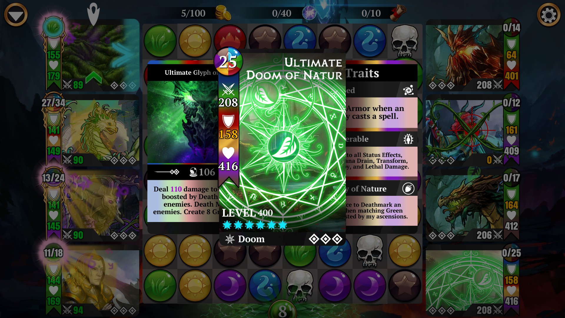
Everyone downloading version 8.8 of the game will have immediately noticed that Inf+2 have changed the game’s fonts. I thought this merited a small amount of analysis. (Yes, I know they’re technically called type-faces, but you know…)
Here are my thoughts and feedback:
- This is an odd use of developer time. I really don’t see how this improves the game, and it comes with significant risks of a worse player experience.
- I have no major problem with Serif and Semi-Serf fonts, but they aren’t exactly in fashion at the moment. There’s definitely a handful of places where the simplicity of the former Sans-Serif font will be missed, for taking in key information at a glance.
- The decorative, semi-serif font seems to have significant aliasing problems. I suspect it needs significantly more hinting to work well at so many different sizes and against so many different backgrounds. That said, part of the problem may be that it has been designed with deliberately frayed edges to many letters – similar to how the Delve maps have an aged and torn aesthetic. Unfortunately, at small sizes, these rough edges look a lot like unprofessional aliasing.
- I immediately noticed two things that are now harder to read clearly: i) the number of turns remaining of a storm, in battle (particularly a skull storm); and ii) the Class name of the Hero in a team graphic. Both of these problems can be fixed with a black outline around the text. These problems have likely been around for ages, but the new fonts make them problematic enough to require attention. The same fix might be appropriate to a number of other graphical scenarios, such as the loading screens which depict various kingdoms.
- As specific example of point 2: the mana cost for each troop, when viewing the full troop card (especially in-battle, but really everywhere) needs to return to a sans-serif font. It’s just too hard to interpret the number at a glance, which is how we generally absorb this information. Even if nothing else goes back to a sans-serif font, this does need to.
- Carrying on from the previous point, the font changes breach one of the key rules of GUI design: Consistency. In a battle, we see all the skills in a sans-serif font, but when we click on a troop to inspect or cast it, the skills are in a strongly serif font. Aside from the previous point, I wouldn’t encourage any other changes to increase Consistency, but I’m disturbed that you aren’t aware of this primary graphic-design principle. (I can’t find the video, but the “three Cs” I encountered a long time ago were: Consistency, Clarity and Content.)
Sadly, I’m not hopeful that anything will be changed – Inf+2 have a long history of failing to implement important tweaks after GUI changes have gone live (eg: the loss of easy troop rarity identification, and the disastrous Victory screen changes).
In case it helps, I’ll recap my action points for the devs: the new fonts require outlining in more places; mana cost needs to be sans-serif when viewing full troop details; and the decorative font needs some hinting improvements so it doesn’t look aliased at small sizes.
What do other people think of the new fonts?
Will we just get used to them over time?
Have I made some good points that need actioning?
(If you just don’t care, or wish to be abusive, this is not the thread for you. Please take your vitriol elsewhere.)