Main two images:


There have been a bunch of updates to the UI recently, but at least one fairly easy/low-hanging fruit upgrade that’s sorely been missing is yet to be looked at.
I think it’s fairly safe to say upgrading Kingdoms and their Power Levels is a core game experience, right from new players to the end game.
When navigating Kingdom Power Levels, and the required criteria to upgrade to the next level, it takes way too many clicks (4, to see the next Kingdom) and is far too cumbersome to get a sense of what current roadblocks are faced.

One simple solution to cycle through Power Level requirements for each Kingdom would be to add a ‘forwards’ and ‘back’ arrow on either side of the Power Level criteria to navigate to the next Kingdom’s requirements. This brings the number of clicks down from 4 to 1 (although you can’t specify which Kingdom). I’m sure this has been suggested before, although perhaps not formally, but even if not is still long overdue and needed.

This is still a little bit cumbersome if you are trying to look at ALL Kingdoms.
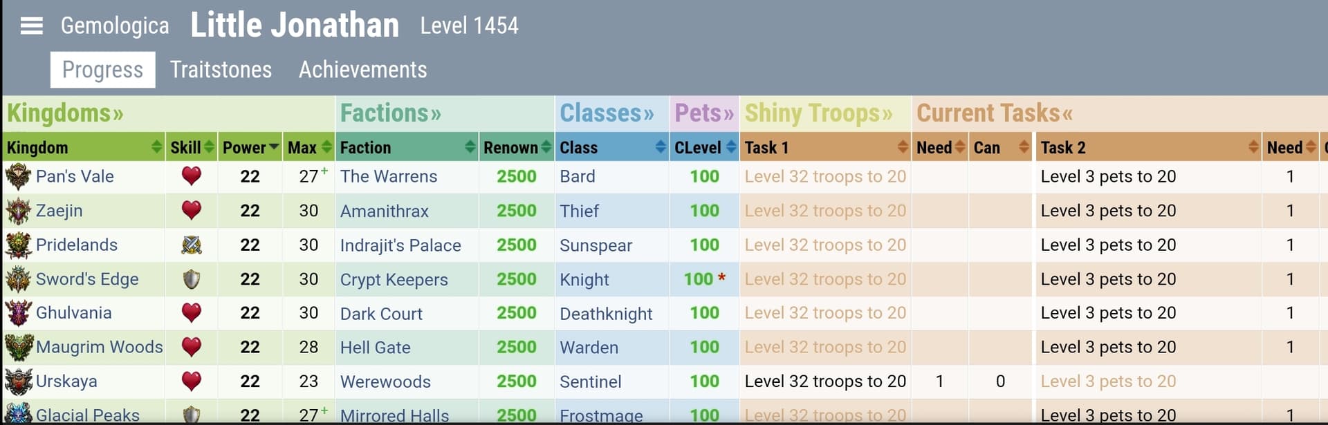
There are likely external tools (e.g. Gemologica) that can help with this, but I don’t think that helps everyone or should be necessary for a good game experience.
I suggest a couple of options.
- A menu that shows all incomplete Power Level requirements in a scrollable list, under each Kingdom – accessible from the Power Level screen in each Kingdom
- A general Kingdoms Overview menu, which would be a scrollable list of each Kingdom in rows, with info in columns such as stat bonus (magic, attack, etc.), Power Level tasks/status (I understand this could be difficult to condense – perhaps icons?), troop ownership (e.g. 12 out of 25) – anything useful for comparing or not easily shown elsewhere, but not too cluttered. https://gemologica.herokuapp.com/ is a great example of what it could look like, or be similar to.


1 seems easier. Do #1. Set #2 as a stretch goal.
I welcome feedback.