Players keep posting feedback after changes and pointing out how dumb many of them are, and it feels more and more like the people deciding what to change in the game have no idea how the game works, what players want or how to improve things.
But beyond that, certain things are just so freaking unbelievably obvious that I don’t care how little you understand the game or how people play it, you HAVE to know it’s a bad move. Like, I can understand how someone can be foolish enough to think that adding the blue box and arrow when a troop has full mana might be helpful, but when players complain loudly and often about that, adding a blue ring (that looks too much like enchant anyway) is unbelievably bad and I don’t understand why any reasonable person would do that.
Worse, the change to the pause menu, without any other context that might explain it (like more other information being added that needs multiple pages) is just bewildering. The old pause menu had all the information needed on one page, and the chat button could be used to bring up an option box to make adjustments to game speed. Instead of adding the volume sliders to the chat pop-up where the ability to change stuff already exists, it now fills the bulk of the pause menu and we have three pages to scroll through in order to access LESS information that we had before. Why three pages, not two (one for all the information we had before, one for options like volume)? No idea. But I refuse to believe that whoever made these changes couldn’t figure out that what they were doing was a bad job. By making the pause screen harder to use and less informative, it’s SO very obvious that the result would be worse. How can they not have seen that?
So the obvious answer is that the game must have been fine as it was but someone was being paid to change it, so they made a change they knew was bad, rather than admit that they didn’t need to fix what was broken. Because the alternative is that they’re trolling players, and I don’t think there’s any way to tell the difference, but either way, these ridiculous changes that anyone can see are bad need to stop.
To be fair, not all the changes are bad. It’s just that it’s hard to focus on something good, when it arrives alongside monumentally bad changes too. Those changes that ruin the game experience are gonna be front and center in the minds of any players affected by them.
If they want to keep players playing (and paying), they need to make good changes, not bad ones.
On the topic of the blue ring, this is absolutely ridiculous:
Otherwise, yes, the pause menu change - just like the card design change - is bad.
They should have rather spent time on some of the many QoL changes players have been asking for than changing something that wasn’t broken at all.
Okay, that one’s a mobile-specific problem (likely related to the portrait aspect ratio), on PC the “ready to cast” glow is the same size as the Mana Orb placing it inside the orb, not outside.
Also, would it really be too much trouble for vertical aspect ratios to arrange the Troop cards in rows above/below the play grid, so that the play grid occupies the full lesser dimension of the available screen space?
Yes yes yes! Im a newer player. When I first started playing I dug around for a setting that would do that lol. I was so suprised when there wasn’t. I like to do easy battles while out walking the dog but I can’t see much so I just do level 1 explorers on phone walking the dog. Please do stuff like this to actually make the game better as making it better for new players is obviously failing.
Yes it is. It’s also specific to portrait mode.
But there weren’t any issues like that before. Just another thing showing how haphazardly thrown together things are currently.
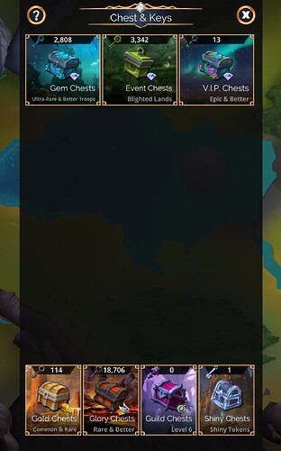
Look at the before and after of the spacing of chests in portrait…
Before (the rectangle is just a blackscreen video)
After (it already looked like that before shiny chests were added)
I don’t think that was a conscious decision but it’s a symptom of what’s currently going on with the game.
I do understand it can get deceptively difficult to design a UI that can dynamically arrange arbitrary screen elements to fit arbitrary dimensions/aspect ratios … I can even speak from personal (hobby) programming experience. (Yes, the IDE had presets to perform this for you, but I couldn’t get them to work consistently the way I wanted to, so I resorted to doing it myself…)
Remember: Doing it right first time gets the job done. Doing it wrong half a dozen times gives job security… ![]()
The blue mana glow is intended and only bothers a few people, not important, i tried.
I fimly believe they have some exec whos never played any game making decisions that are designed to generate revenue. A lot of these changes dont make any sense but they all come with pay features that work pretty well. Clearly the bottim line is more important than delivering a quality product but isnt that how everything is now?
BTW this is how it looks compared to/with enchant. There’s clearly something wrong here. Rushed, huh?
Probably worth mentioning that the blue circles are on a higher layer than anything else, meaning when you cast a spell and the animation shows your troop move across the screen (and says the name of the spell and plays an audio) the circle appears over the top of the troop.
Pretty sure that’s not intended, but at this point who knows?


