Probably related, anyone remember the days when the patch notes didn’t fit on a beer coaster?
before i report a bug: anyone noticed that the screen seems to jiggle more now on explosions, spell cast and skull poke?
i think this once happened in the past and then the devs removed it.
i’m getting almost sick now, playing a lot of explores with explosions.
That’s not a tiered flash offer.
They will look somewhat like this:
** DISCLAIMER: The following was a test image from the 5.4 beta. All data, offers, and prices on the image are placeholder data and do not represent any potential offers that will be presented in the future to players.
So by “tiered” they mean “diminishing marginal returns.”
“All data, offers, and prices on the image are placeholder data and do not represent any potential offers that will be presented in the future to players.”
With each patch I make sure that the “Feature Requests and Game feedback” section of the forum is not needed by the developers and exists only for the players.
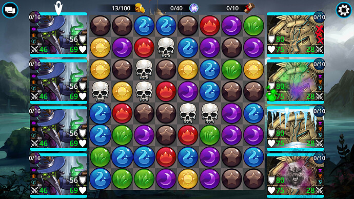
Is that circle with a wolf’s face the actual debuff in-game? Because then I also have an aesthetic issue with it as well as a game mechanics issue — does not fit in with the style of other status effects (wasn’t “consistency” the excuse we were given when the pretty medal art was replaced by ugly art drawn by, I can only assume, untrained children?) and, frankly, looks terrible and out-of-place to me.
![]()
10 characters
MY WIFE LITERALLY IN THE PAST 10 SECONDS JUST HAD A BETTER IDEA:
WATERMARK OF THE FULL MOON. BOOM.
POST IT. PIN IT. LOVE IT.
Try harder, game designers, this is truly a new level of awful that I will hate every time I personally experience it, which will hopefully not be often because I will actively be going out of my way to avoid it.
EDIT for (and no, the watermark doesn’t have to be the thing — it could have been anything effect-wise that matched the other stuff. Maybe a shimmering streak of moonlight [that could even increase each time it fails to cleanse to show its increases chance to proc or something; a border of ragged-looking hairs,; an application of scratches — SO MANY THINGS could have looked better, but I guess this junk mechanic doesn’t deserve to have anything better than a junk stamp plastered over everything else)
Dwarven gate has a wolf face now! What, it’s kind of cute, no? …No?
It looks like a placeholder image someone used during early design phase, back when they were still figuring out what the status should do exactly. So, before spending time on how it should actually look, they just grabbed a random werewolf image from google images to slap on it temporarily. …And then they forgot about it, and released it.


Think you may be right Snooj!
I meme… really. It’s just getting sad now.

Please tell me this is a joke, a photoshop, something other than reality
EDIT:
Found it myself. It’s literally a stock image on Google.
Oh boy that doesn’t look good, would be even funnier if the image is copyrighted and 505 hadn’t paid for its use ![]()

Scramble to come up with replacement art?
IMHO Essence of Evil needed a bit of a nerf; it’s overpowered and overused.
Be careful its a whole gang on these boards that will jump at you now. ![]()
By who, where, because I vehemently disagree.
I only ever use EoE on green day every third war or so. So basically never. And now definitely never.
As far as I can tell it’s free for use if you download while registered, even when you only stay for your free trial period. I don’t really see anything wrong with it, if it’s offered for free, why not use it? Most of us also don’t insist on paying for the game when allowed to play for free. ![]()

